How I Prototyped an AI Copilot Using Only Coding Agents

Overview

The one where I lead the product design team to rapidly iterate on an AI feature, that reduced time to investment, and an effort that introduced design engineering worflows to a startup

Categories

Mobile Native

AI feature

Design Engineering

Date

Aug, 2026

The project setup

Team setup

Senior Product Designer
Lead Product Manager
Engineering Lead
4x engineers
Distributions analyst

Chief Operations Officer

Business Consultant

My role

AI Experience Discovery
Strategic Product Definition
End-to-end Product Design

Design to code engineering
Remote & in-person user testing

Outcome

An intuitive investment flow, built seamlessly on top of an existing b2b wealth management dashboard.

The problem

Vennre didn't want to miss the chance to ship an AI enabled feature to its customers. The challenge I had was identifying the opportunities within existing user behaviours, where an AI feature would bring the most value

Key goals

Define AI feature experience

Define AI feature experience

hero-image
Hero Image

accelerate deal reviews

accelerate deal reviews

make AI findings verifiable

make AI findings verifiable

Hero Image

keep judgement with humans

keep judgement with humans

Discovery
Strategy
Design
Engineering
Phase 01

Discovery
& Research

I started by questioning the brief, that solutionised an AI first feature without any user insights. I interviewed existing users and wider pool of wealthy investors, to uncover an existing problem, that can be solved with AI

User ResearchExplorationCompetitive landscape
Phase 02

Setting
Product Design Principles

Next I worked closely with the product manager to agree on a set of experience principles, and wrote the story story of the product. This helped to set the direction for the feature, and the narrative which will be used to get an internal buy-in

RoadmapPositioningMetrics
Phase 03

Interface
Design

After that, I sketched out initial screens and designed key moments of the investment deal co-pilot in Figma. After this, I worked directly in Claude Code (using Conductor & paper) to create a real coded prototype, deployed only for anyone to test

UI DesignPrototypingDesign System
Phase 04

Testing
& Refining

After that, I validated the design decisions and behaviours with a limited testing group on staging server. Lot of my effort was on dialing in the backend LLM model weights, response length, and response to edge cases such as misuse, or escalating issues to customer service.

User testingSynthetic Users

Product story

We are designing a conversation. Not another chatbot. To do this, we will create a copilot that exists as a layer over the invest experience. We want to create a premium, trustworthy design.

Product principles

Calm experience

No mascot, no chat bubbles in candy colours, no typing-dots theatre. The copilot uses the same serif/sans hierarchy, the same card system, the same restrained blue as the rest of the product

Calm experience

No mascot, no chat bubbles in candy colours, no typing-dots theatre. The copilot uses the same serif/sans hierarchy, the same card system, the same restrained blue as the rest of the product

The deal stays in view

Everything rises as a bottom sheet over the deal page. The assistant behaves like a lens you hold over the deal rather than a room you walk into

The deal stays in view

Everything rises as a bottom sheet over the deal page. The assistant behaves like a lens you hold over the deal rather than a room you walk into

One question per screen

We use conversational pacing, and it's what keeps the copilot feeling natural, and like an advisor. The chat window has a clever use of spacing, to allow the responses to space to breathe

One question per screen

We use conversational pacing, and it's what keeps the copilot feeling natural, and like an advisor. The chat window has a clever use of spacing, to allow the responses to space to breathe

Guided, but never on rails

At the craft level this becomes tap, don't type. Every input is a designed control, so the user means exactly what the system hears

Guided, but never on rails

At the craft level this becomes tap, don't type. Every input is a designed control, so the user means exactly what the system hears

Defining user flow

I worked closely with PM and tech leads to propose the user journey, highlighting dependencies on back office


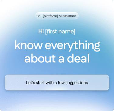
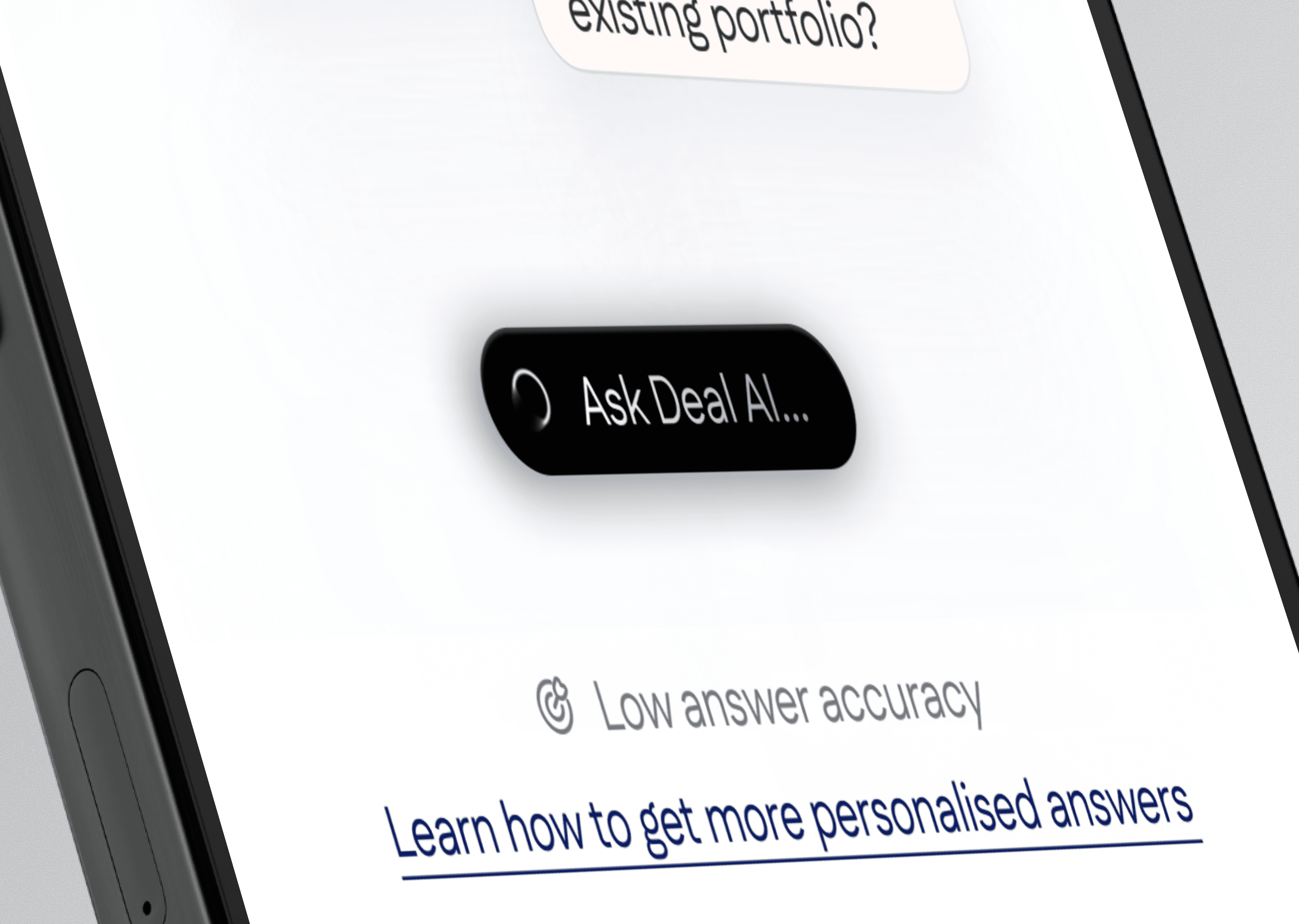
Imersive motion design, built around the idea of living and breathing deal co-pilot

Experimenting with different direction for opening visual 

Experimenting with different direction for opening visual 

Trade-offs

Not every problem had a clean fix. These were two moments where the work meant choosing between two imperfect paths and being honest about what the choice cost.

Demonstrating the value & capabilities

Challenge

We can't expect users to instinctively know how to interact with the feature

No way to guarantee learnt behaviour

Some clients interact with wealth coaches - higher expectations

No way to guarantee safety on contracts we hadnโ€™t seen

Trade-off

Accepted

Chose to indicate capability, rather than spell it out

Launched with an indication of capability, rather that definition

Toned down language on recommendation from legal

Signposted to customer services

Increase engagement & CTR

Challenge

Adding to a page already saturated with content

Concern users would miss importnant content

Hiding it felt dishonest, showing it added friction

Placement early on the page might have meant important content was missed

Trade-off

Accepted

User motion & subtle interaction to engage users

Shipped component acceptable even on small devices

Suble motion & interactions increased engagement

Placed at the top of the page

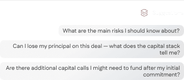
Rather than creating an on-the rails conversation thread, the chat interaction uses well known patterns, with added personality
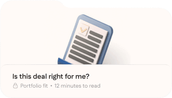
Variants of suggested questions

Trade-offs

Not every problem had a clean fix. These were two moments where the work meant choosing between two imperfect paths and being honest about what the choice cost.

Freeform vs guided conversation

Challenge

Users werent sure what conversations to start

Open-ended conversation were too vague

Outputs led to halucination & inaccuracies

High barrier to entry

Trade-off

Accepted

Launched with preselected questions

Randomised selection of 3 questions from 12

Legal approved language of questions

Ongoing measurement & learning

Truncating vs limiting output text

Challenge

Users rejected long answers

Long-form answers didn't feel suited the formfactor

Hard limit character limit could have lead to omissions

Risk of halucination

Trade-off

Accepted

Set parameters for output text

Questions that required factual data had higher character limit

Key points were covered in first 1/3 of output

Truncation added after 200 words

Documenting the decisions

Founders & senior team prefered static documentation. I recorded Loom videos, explaining front end behaviour and dependencies for every touchpoint

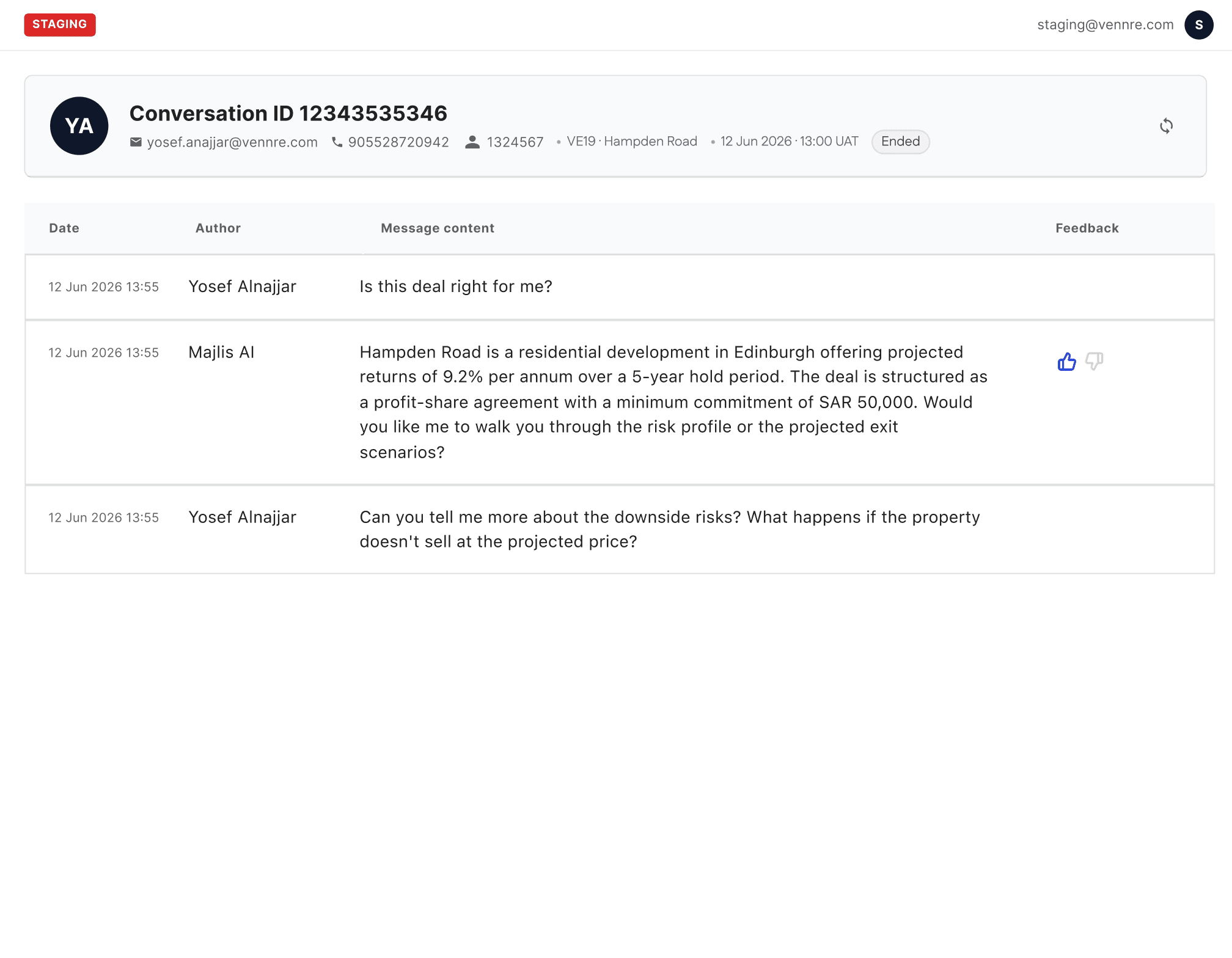
Example of updates to backoffice

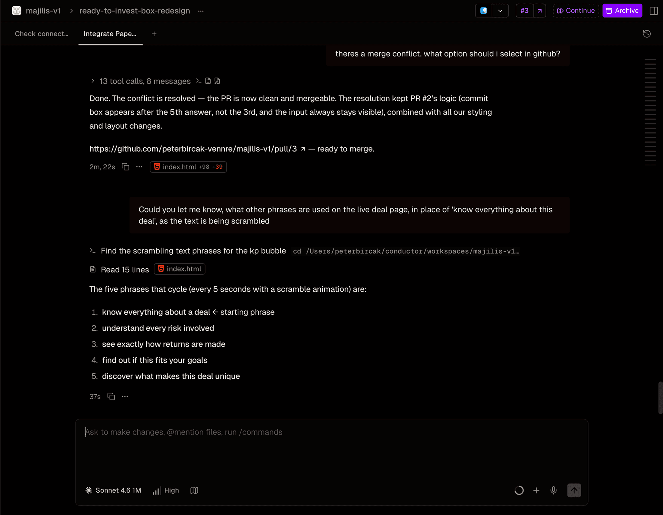
Almost all interaction and prototyping was done with coding agents, using a stack of Conductor, Paper MCP, and Netlify for rapid iteration

Example of running multiple parallel agents in Conductor

Example of work in paper.design