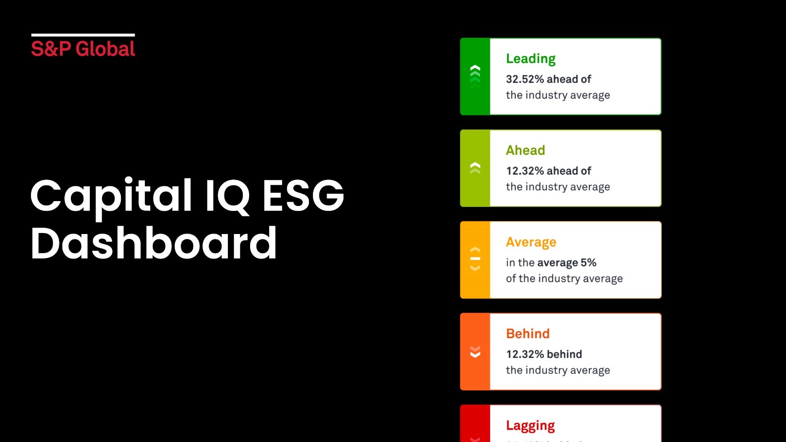
Complex data visualisation for a B2B dashboard
Overview
The one with a B2B Saas product where Icommunicated a complex data challenge to tell a comprehensive story of environmental impact of a company, that lead to an increase of ESG reporting
Categories
Dashboard
Finance
Date
Jan 15, 2025
Description
S&P Capital IQ Pro’s system current displays ESG metrics, but feedback from users has described that the existing way of displaying information is difficult to understand, especially how it impacts the companies and industries the are reviewing on their portfolios.
Key objectives is to help tell the story of a company about its environmental activities and impact to CapIQ Pro users, who are new to ESG environmental storytelling.
CapitalIQ is a market intelligence platform by S&P Global, similar to BLoomberg terminal, it hosts a number of financial market and company information for users to research, analyse and make assessments so they can make informed decisions. Typical users include e.g. fund managers, institutional bankers, analysts. etc
Key goals.
Create a comprehensive dashboard
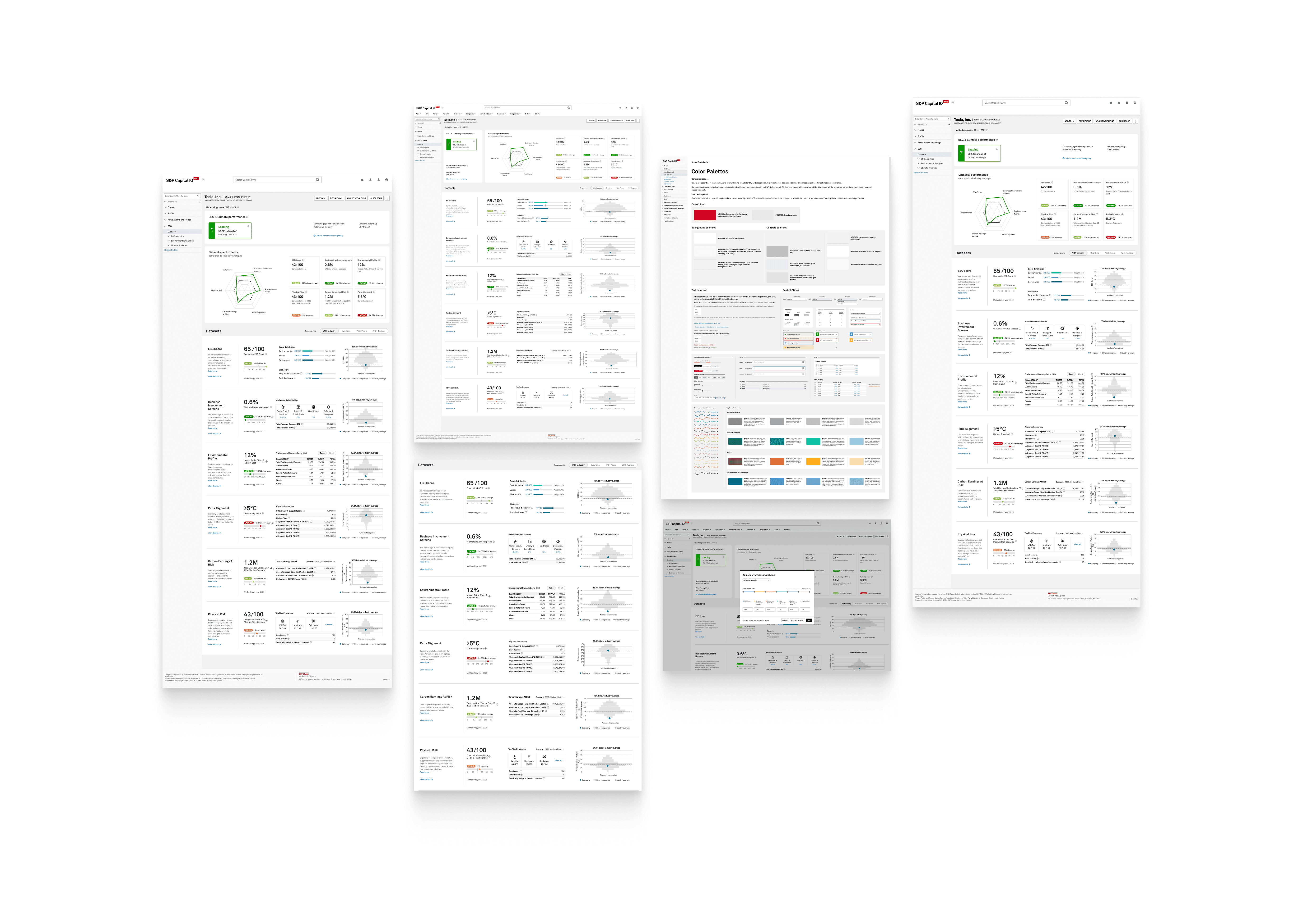
Create designs for a company dashboard that displays the following: ESG scores, Climate risk and Performance, Physical risk, Business Involvement screens.
Designs should work for premium and freemium users, with premium being able to access more detailed data and delve deeper in benchmarking.
Driver higher value user engagement
Make it easier for users to understand ESG metrics and also encourage them to actively explore and engage with the environmental impact of companies in their portfolios though custom benchmarking, and interactive data visualisation.
Drive conversion to premium offer
Ensure that users see the premium offer as a valuable upgrade to their financial research and analysis capabilities with clear value proposition of the premium features. Through improved onboarding processes and a transparent showcase of the additional benefits.

Process.
Understanding data and user needs
With experience analysis with a deep understanding of user behaviour and motivations, we embarked on a process to create user-centric digital journeys that cater to the needs CapitalIQ's diverse user base. This approach ensured that our design solutions were not only aesthetically pleasing but also highly functional and aligned with the goals of fund managers, institutional bankers, analysts, and other typical users, enhancing their ability to create a good ESG picture of their portfolio.
Datapoint mapping
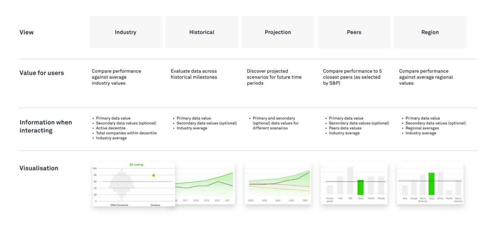
Map out data such as carbon emissions, sustainability initiatives, and environmental compliance in a way that allows users to easily grasp a company's environmental story. The goal is to provide a visual narrative that helps users understand how a company's environmental activities align with ESG principles and how they may affect the company's overall sustainability and risk profile.
This can be achieved through well-designed data visualisation techniques and user-friendly interfaces that make ESG datapoints more accessible and actionable for CapIQ Pro users, ultimately aiding them in making informed investment decisions.
Creating information architecture
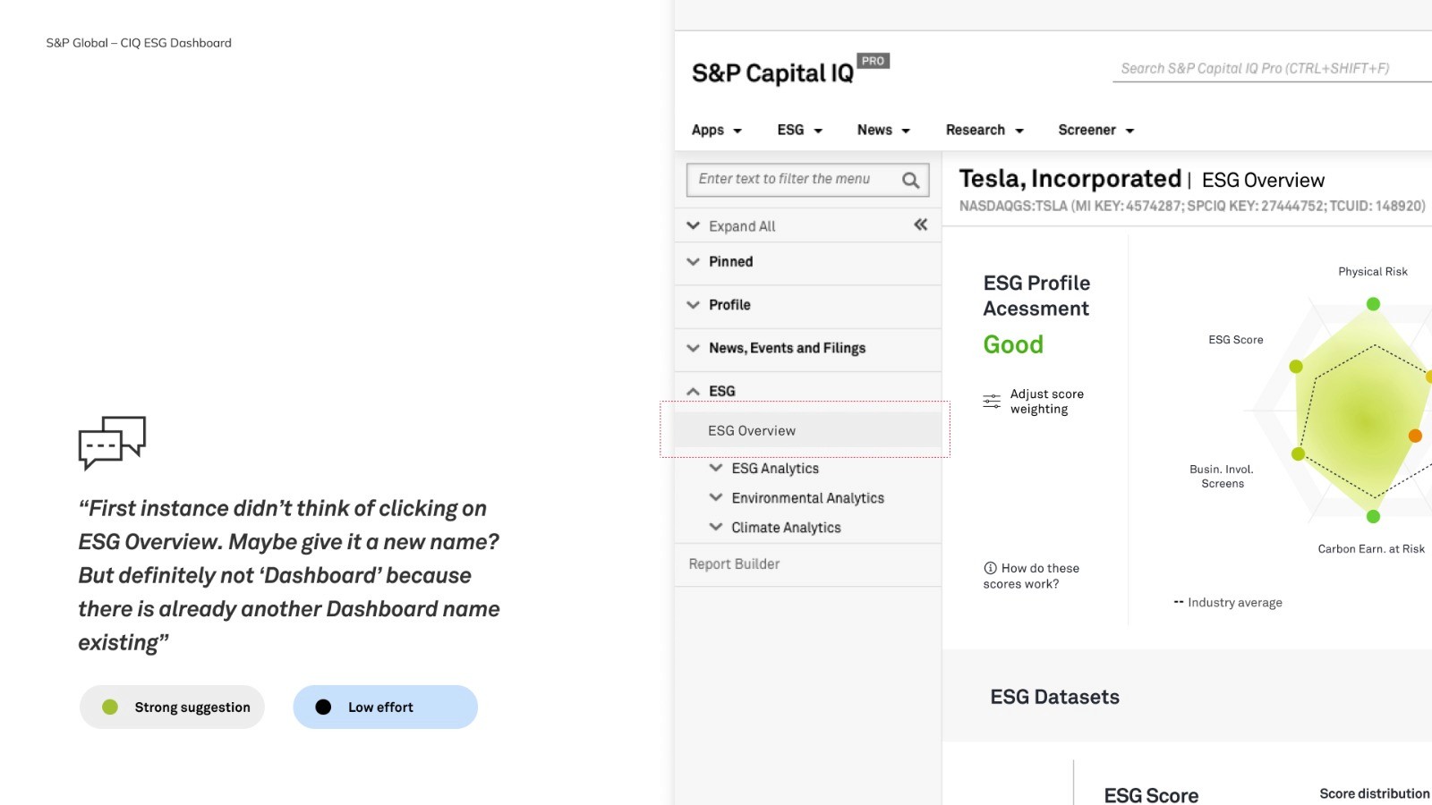
Design a clear and logical hierarchy, intuitive navigation paths, and effective labeling across capitalIQ navigation to help users efficiently access and interpret the environmental impact data of companies, ultimately aiding their decision-making process in the financial sector.


Validating through user testing.

Validating with real & synthetic users
I conducted comprehensive testing over the course of three days, with an additional day dedicated to testing with internal stakeholders. During this process, we meticulously captured insights that were mapped according to their complexity, as assessed by our development team, and their potential impact on the users.
This rigorous testing and evaluation allowed us to refine and optimise the product design, ensuring it effectively addresses the challenges posed by displaying ESG metrics on the dashboard

Project retro.
Organised and user friendly summary
Break down complex information into a summarised view by providing guidance, help users get overview of company’s profile, and provide guidance to explore more details
Useful ways to compare data
Implement intuitive data visualisation techniques and interactive tools, and enable users, such as fund managers and analysts, to easily compare environmental metrics across companies and industries. Facilitate a deeper understanding of ESG data but also empowere users to make more informed decisions about their portfolios by identifying trends and patterns in environmental activities and impacts.
Elevate value of subscribing to premium datasets
Propose a way to highlight what users are getting with premium subscribtion, incentivise to reach out to sales reps, without alienating existing freemium users.